Visualizing a Network of Relationships

- Visualizing the 0ver 100,000 connections between owners and owned entities

Page updated: 25 February, 2019
Project: October, 2017 - Acumen, LLC


This tool provides a visual representation of a highly connected dataset, to understand the relationship between health care owners and providers.

PROCESS:

As the main contributor on this project, I was involved in the Discussions, Brainstorming Sessions, Designing, Documenting and Implementation stages.

Process diagram

TECH STACK:

  • JavaScript - JQuery
  • D3.js for the map visualization and interactions
  • require.js to include libraries, modules
  • Bootstrap for the tutorial

I follow a Model-View-Controller pattern to structure the code:

Model View Controller Diagram

SCREENSHOTS:

Click to view full screen ...

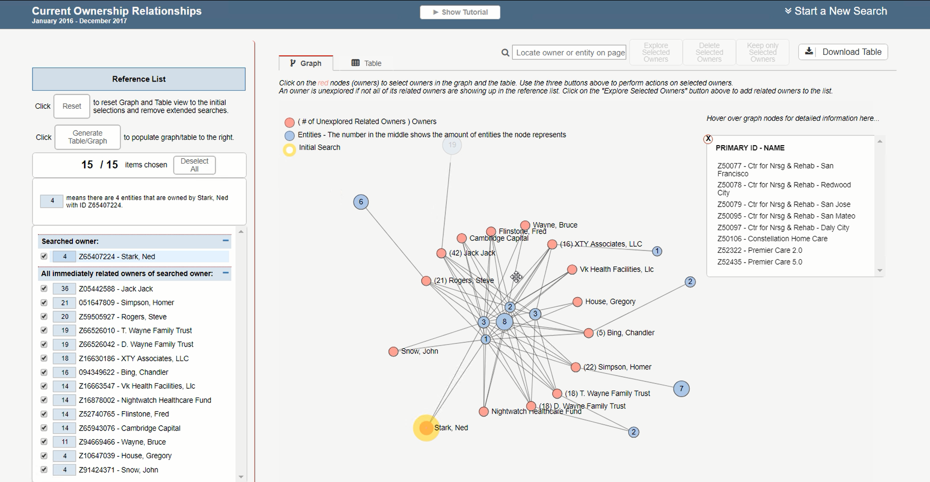
Graph view showing connected owners and providers.

Click to view full screen ...

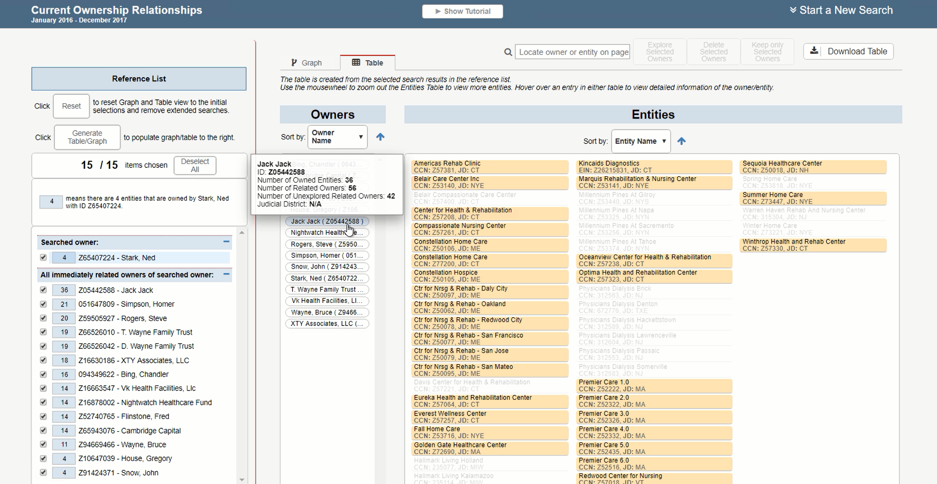
A table representation of the graph view.

DEMO:

CHALLENGE:

One of the major challenges in developing this application was the clients changing requirements and the tight deadlines.
To meet the deadline, I spent a some time to plan out and document the code first – specify the variables and functions I would need, etc.
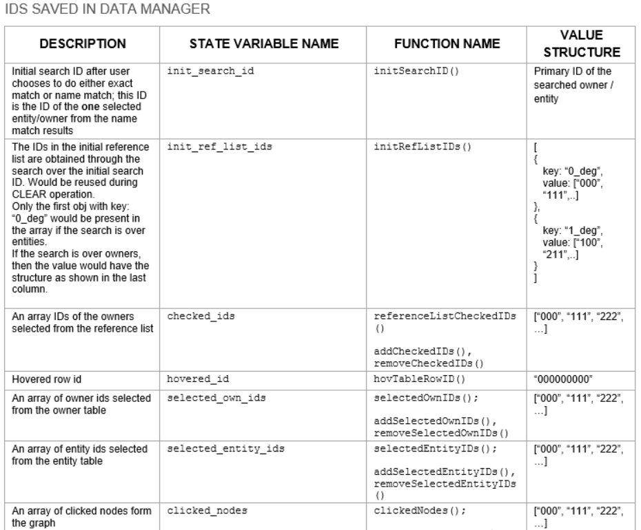
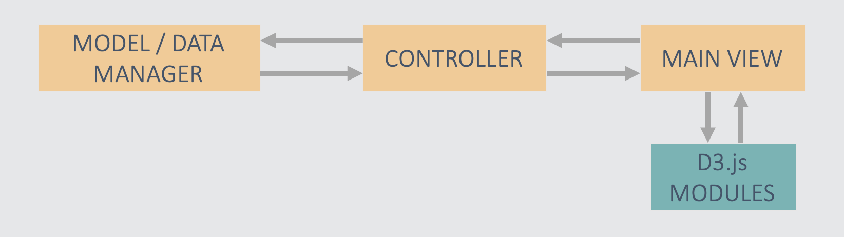
The screenshot below is a snippet of documentation I made before implementing the code.
After many iterations of the document, and once a clear direction was visible, I coded it up.

Snippet of code documentation